There are countless times in the life of a Universal Windows Platform app developer when the "Transparent" color comes handy. However, it is good to remember that "Transparent" is still just a color, otherwise you can encounter some unwelcome surprises.

Animating transparent color
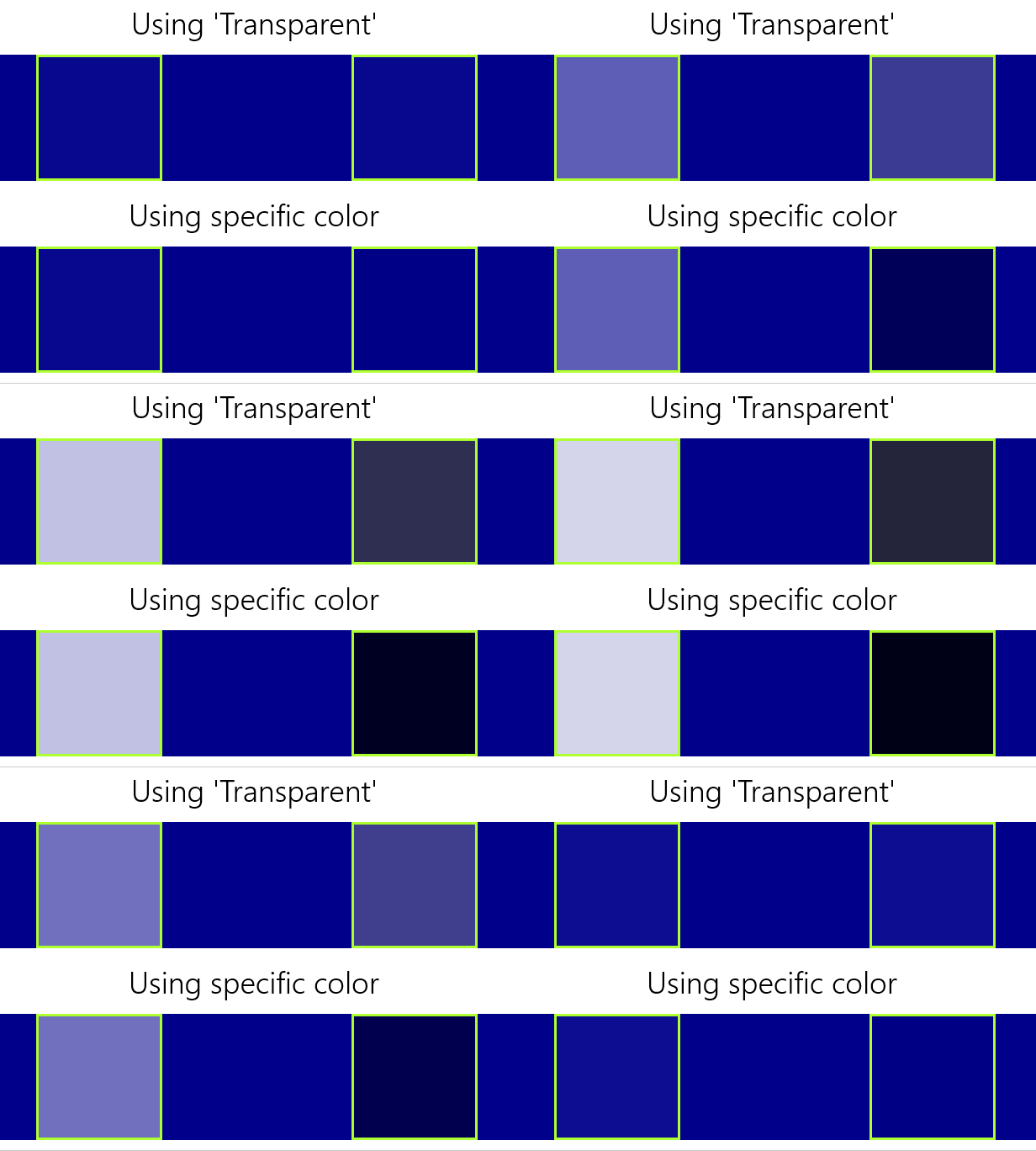
In my project I wanted to animate transparent background of a Border element to the current system's default background color using XAML's ColorAnimation . What I noticed however, is that while everything worked great with the Light system theme, the animation did not work properly in Dark theme. As you can see from the GIF example, the animation on the right clearly shows signs of light gray color halfway through the animation, which just looks out of place as the result goes from transparent to lighter and only then to black. Why is that?
Hey, don't blame me, I'm just a color!
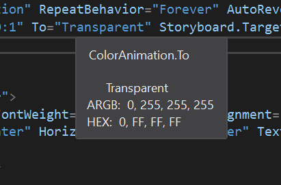
Although the reason might not be apparent at first, it is actually very simple. We have to remember that "Transparent" is still just a single color. That means it is a set of alpha, red, green and blue color values. So in fact, although the color itself is invisible, it still has some values for red, green and blue! And what are these values? The Visual Studio IntelliSense is here to help:

As we can see, transparent is a actually an invisible white color! This fact does not matter at all in most cases, but has huge implications when "Transparent" color takes part in animations. In my case the animation went from invisible white to black, which caused the ColorAnimation to grow slowly turn not only the alpha channel's opacity, but also drop the other color values from 255 to 0, which casues the flash of gray colors during the animation.
How to avoid this?
The easiest way to avoid this problem is to avoid "Transparent" color altogether. There is not a single transparent color. In fact, there are 16777216 different fully transparent colors! If we specify the Border's Background property to be #00000000 (invisible black color), the animation will look as expected. The same goes for any other target color. If we want to animate a color to #FFRRGGBB, the optimal transparent color you should start with is #00RRGGBB, because the animation will then actually only "reveal" the color you want using the alpha channel and the other channels will remain unchanged.

Source code
Sample app with the transparency animation is available on my GitHub.
Summary
It is good to remember that the XAML named "Transparent" color is still just a simple color and in cases like animations we can be surprised to find out that we don't get the results we expect. Being specific about the choice of colors using hexadecimal values is a simple way to avoid this.