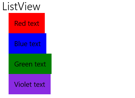
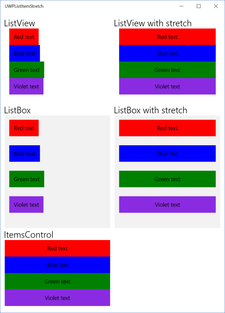
The UWP ListView and ListBox controls can be used to present lists of items in the user interface. By default the items are left-aligned and take up just the space they require, which is unfortunate if you want to stretch them to the full available width of the list control. How to achieve that?

ListView and ListBox: ItemContainerStyle
We would expect, that the item alignment behavior is influenced by the HorizontalContentAlignment property on the list controls. Surprisingly this property has no effect. To align the items, we have to go further and use the ItemContainerStyle . This Style affects the behavior of the container of individual list items and targets the ListViewItem for ListView and ListBoxItem for ListBox . The HorizontalAlignment property sets the horizontal alignment of the item container itself. This is Stretch by default. Thanks to this the mouse can hover over the full width of the control to activate any item. The HorizontalContentAlignment proerty sets the alignment of the item contents. By default it is set to Left and that is the culprit. If we set this property to Stretch , the item will stretch to cover the entire available area. Here are the example styles you can use for ListViewItem and ListBoxItem :
<Style x:Key="ListViewItemStretchStyle" TargetType="ListViewItem">
    <Setter Property="HorizontalContentAlignment" Value="Stretch" />
</Style>

<Style x:Key="ListBoxItemStretchStyle" TargetType="ListBoxItem">
    <Setter Property="HorizontalContentAlignment" Value="Stretch" />
</Style>
You can then use the styles with your ListView and ListBox controls like this:
<ListView ItemContainerStyle="{StaticResource ListViewItemStretchStyle}" />

<ListBox ItemContainerStyle="{StaticResource ListBoxItemStretchStyle}" />
ItemsControl
There is one more list-based control in the UWP XAML Toolbox - ItemsControl. This is arguably the simplest list control, lacking many features like built-in interactivity and scrolling. The default item container control for ItemsControl is just a simple ContentPresenter , which luckily has its HorizontalContentAlignment set to Stretch by default and the items are automatically stretched.
Sample code
Sample code for this article is available on my GitHub.
Summary
Stretching the items in UWP's list controls is a little less intuitive at first, but still not too complicated and thanks to the smart way the controls are composed offers great opportunity for customization.
